

 [2]
[2]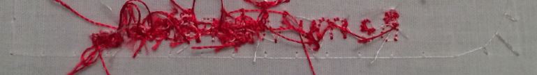
 462627
Dear Sewmom - I have absolutely no idea how to digitise, although I do realize that 1/4 inch is very small and probably very difficult. I am sure with practice and the help of some Cuties all will be well. Hugs Sarah.
 253107
Sewmom
If I may add my penny worth.When I digitised my first design, Meganne, gave me this advice
It is best to try to have as few stops n starts as possible. SO. Have the end of the 'b' and the start of the 'e' at one point. The same would apply with the next two words. PM me if you need any help
hugs
Helen
 39739
39739I took out the cut between each letter and it worked fine. I also played with double stitch and bean (triple.) My final project will use the bean stitch. Thank you everybody for your input!
462627Did you resize the design after creating it? Is your bobbin going in the right direction? Check the top threading of your machine to make sure it is threaded correctly would be my suggestions. Start and stop should not be a problem that would look like this.
What software are you using?
 10494
10494Not familiar with the software, but did look it up on the internet and under features it says that the software comes with Lettering options.
Maybe that the cut after each letter caused the back to look that way? Maybe there are some tutorials on YouTube or other places that can help.Users Manual?
Christie
 by sewmom
24 Feb 2014
by sewmom
24 Feb 2014
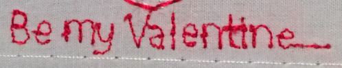
Thank you. It does have plenty of lettering in the software but this was a lesson in digitizing my own letters.
Yes, perhaps I didn't hold the threads back between each letter well enough.
 15036
15036Wow, what a mess! I can't imagine why, actually, if you did each letter individually. I hope someone like Martine or anyone with more experience lettering comes along to help. The front looks ok, but the back looks almost like it was trying to develop nests! What the heck? Hope you get it figured out, hugs, Marji
by sewmom
23 Feb 2014
Maybe my stitches were too small or I needed to change the tension. I don't know either.
 33451
33451Sorry I have no idea at all. What softwear are you using and from having spent the better part of the afternoon producing some lettering and stitching it out I would rethread after putting in a new needle. Out of curiosity what is the font? I hope that someone is able to help. Or quickly iron some iron on Vilene over to stop the stitches coming apart
by sewmom
23 Feb 2014
I'm using MasterWorks II. There is no font, I digitized the stitches myself. It's a first stitch out of this design, I didn't expect it to be perfect so it's a scrap and doesn't need to be saved. It's all for learning. I'm going to make changes to the design and stitch it again I'm just not sure what changes to make for the lettering.
