85867✽
I have seen it both ways and am puzzled!!
Comments (7)
85867✽
20661✽
If there is to be a top and bottom then the top of course as it is the main letter
2 comments
I would have said the other way around, like stacked names always have the big letter on bottom.
Thanks
6340✽
by
marcellelewis
10 Feb 2011
+5✽
I always spread the letters so that they are not touching each other so neither one is on top. If they lap over each other you have an excess of stitches on top of each other that may not look very well. If the underlying stitches on the background letters are removed that would help the appearance if the letters must be overlapped.
An example:
http://embroideryavenue.com/catalog.htm?item=34
Marcelle Lewis
lewismm@bellsouth.net
http://embroideryavenue.com/
http://embroidery.gotop100.com/
An example:
http://embroideryavenue.com/catalog.htm?item=34
Marcelle Lewis
lewismm@bellsouth.net
http://embroideryavenue.com/
http://embroidery.gotop100.com/
1 comment
Marcelle, I do love the Fancy 4" Monogram. It is lovely!
33580✽
I would put the center letter on top if I was going to overlap them.
1 comment
I thought so too, but I have seen both ways.
145305✽
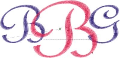
I would either separate them or have them really intertwined and not stack them - played with it and came up with this as a sample of what I mean. However, that can't be done without software and it takes time.
Martine
Martine
1 comment
great idea!!
85867✽
Thanks for your comments and suggestions. I am still undecided. I guess I will try some on my toilet paper holders and see which way I like it best. Putting them on felt will be much cheaper than messing up a towel.
6340✽
by
marcellelewis
10 Feb 2011
+3✽
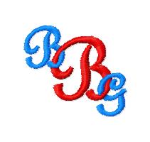
Thank you 'katydid'. When I purchased my AmayaXT and went to school in Atlanta the class put a monogram like that on a tote bag. I was really nervous with the machine. The monogram was 6 inches tall. When mine finished I was so shocked by how well it looked. I couldn't believe my eyes, that I had actually stitched something like that. It did help that my initials were MLM so it was nicely spaced.
The intertwined monogram that 'Mops' posted is nice. If you have digitizing software with your machine you might be able to remove the underlying stitches where the initials cross each other.
Good luck to you on your monograms. Please let us know how it turns out. Can you post a photo?
Marcelle
http://embroideryavenue.com/
http://embroidery.gotop100.com/
1 comment
Thank you for your input. I do have the latest software altho I am struggling as it's capabilities.I have a hard time because I am so computer irritate.. I ,too am in the Atlanta area.