

 [2]
[2]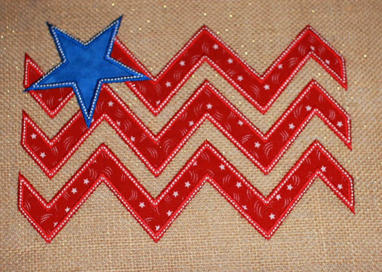
 17461
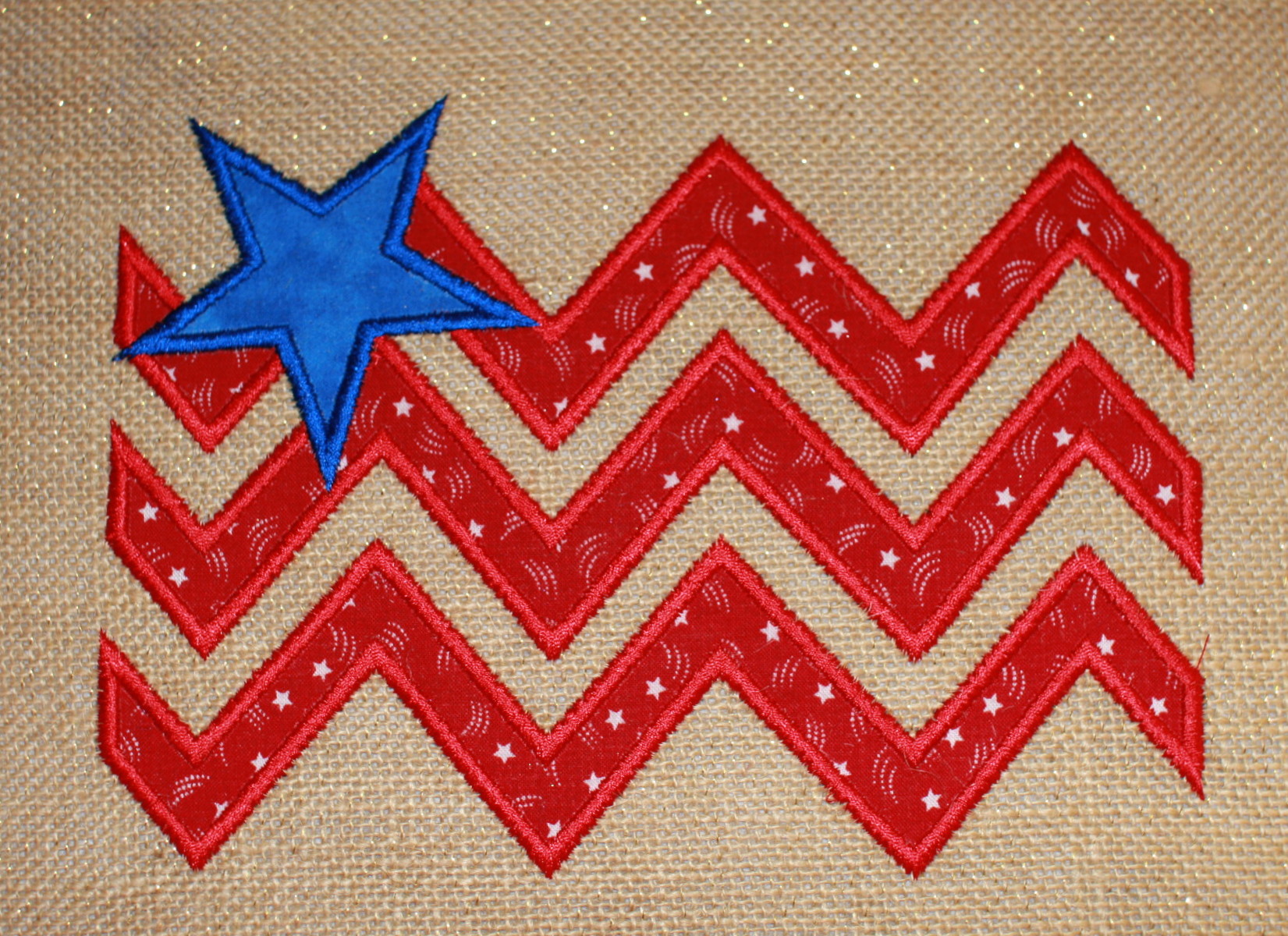
17461If in the garden the top one will stand out better. BUT when you look at the second one up close the white stitching sets it off nicely.
 19439
19439 4061
4061 557
557 234253
Both look great! She should offer both versions. I know the raggedy look is in now. Chevrons are hot also. Looks as if she is getting both looks in one.
 85867
85867I would pick the first one.. the second looks like the edges not finished properly, fabric might fray to much and move from the zig zag, but that's my 2c worth
 824
824I like the top one the best. I don't know what, but something bothers my eyes in the second one. I see some people like the first one, and others the second one. So no help, you just have to pick it yourself.
 by michele921
14 May 2013
by michele921
14 May 2013
oh I already picked the second one but was wondering what others would pick Thank you
 360429
I like the second one, too. I agree that it "pops" out at you. Nice to have choices.
Jo
by michele921
14 May 2013
yes I love choices, she was already giving the zig zag or satin stitch finish and then I go and do this LOL just shows how each person would add their own personal touch to the same design thank you
 32948
32948 18031
18031I prefer the first one
it allows my eyes to travel to the fabric
but you did a great job on both !!
Lois
 1494
1494I like them both, however the second one sings to me louder! Nice Design. Happy Stitchin!
by michele921
14 May 2013
Thank you, I was looking at it before I unhooped and thought it needed that extra pop myself,kinda why i asked the question see what others thought
 173580
i like both you did great job
by michele921
14 May 2013
thank you, i do like them both just thought the white popped the stars in the red more
 119790
I prefer the first one. Makes the star and stripes jump out at you.
by michele921
14 May 2013
Yes that is what I thought too, seems a lot of mixed choices, goes to show we all have our own perspectives on embroidery which is why it is so nice to do can use the same design so many different ways thank you
they both look terrific, I am partial to satin stitch
by michele921
14 May 2013
thank you I do like them both but just thought the first didn't do justice to the material as much as the second one did
 299557
Michelle, definately the one you enhanced with the white...it keeps with the red, white & blue theme of the flag and it gives it more style.....
by michele921
14 May 2013
yes that's why i put the white on to me seemed so plain without it and only a quick stitch to add it on after LOL thank you
 261161
I love them both and would put them on different applications. Love the burlap too. Placemats, jackets, flags very nice design.
by michele921
14 May 2013
yes they both are nice, just with the material I used think the second looks so much better to me LOL thank you
 86901
86901I like the one with the beads best BUT like bothe of them.it would be a hard decision so I would have to make both.
Lenamae
by michele921
14 May 2013
the designer only did the one without, but I thought it would look good with so added it after I sent her pictures LOL I thought it popped the design myself but just wondered how others thought, looks like everyone is torn too lol thank you
 32767
32767I think either would be suitable depending on the application that it is being used on. Personally I opt for the 1st version myself...just seems a little more sutle to me....but again, on certain instances or fabrics the 2nd version would be best. I'm no real help I guess< LOL! ~Rita.
 by awesome1
14 May 2013
by awesome1
14 May 2013
And wouldn't that be neat across the back of a denim jacket? I'd love it. Either!
by michele921
14 May 2013
yes I know we all have our own likes and dislikes, I do like both but liked how it brought out the stars in the material myself so I am always at a lost LOL
Being the 'odd one out' here, I personally like the first version (No.1). Of course, it's probably a 'Man is from Mars - Women from Venus' thing but the top version looks much bolder. Now, my wife would prefer the second version especially if the white beading was in rhinestones (but then I'm not sure at times which planet she is from....lol).
by michele921
14 May 2013
know what you mean, everyone has their own likes, I am making a garden flag after I add wording to it, thank you
Looked at the picture before I read you message and my thought was, I want to see what she did differently on the second one, it pops!
by michele921
14 May 2013
yes I thought the same thing hope she adds it as an option sent her both pics thank you
 158553
Love that design. I like both, the white highlights the stars however. Looks like a great project!!!