

 299557
 38558
38558 18960
18960They are beautiful, what a great idea. They would be nice with christmas designs also.
 4770
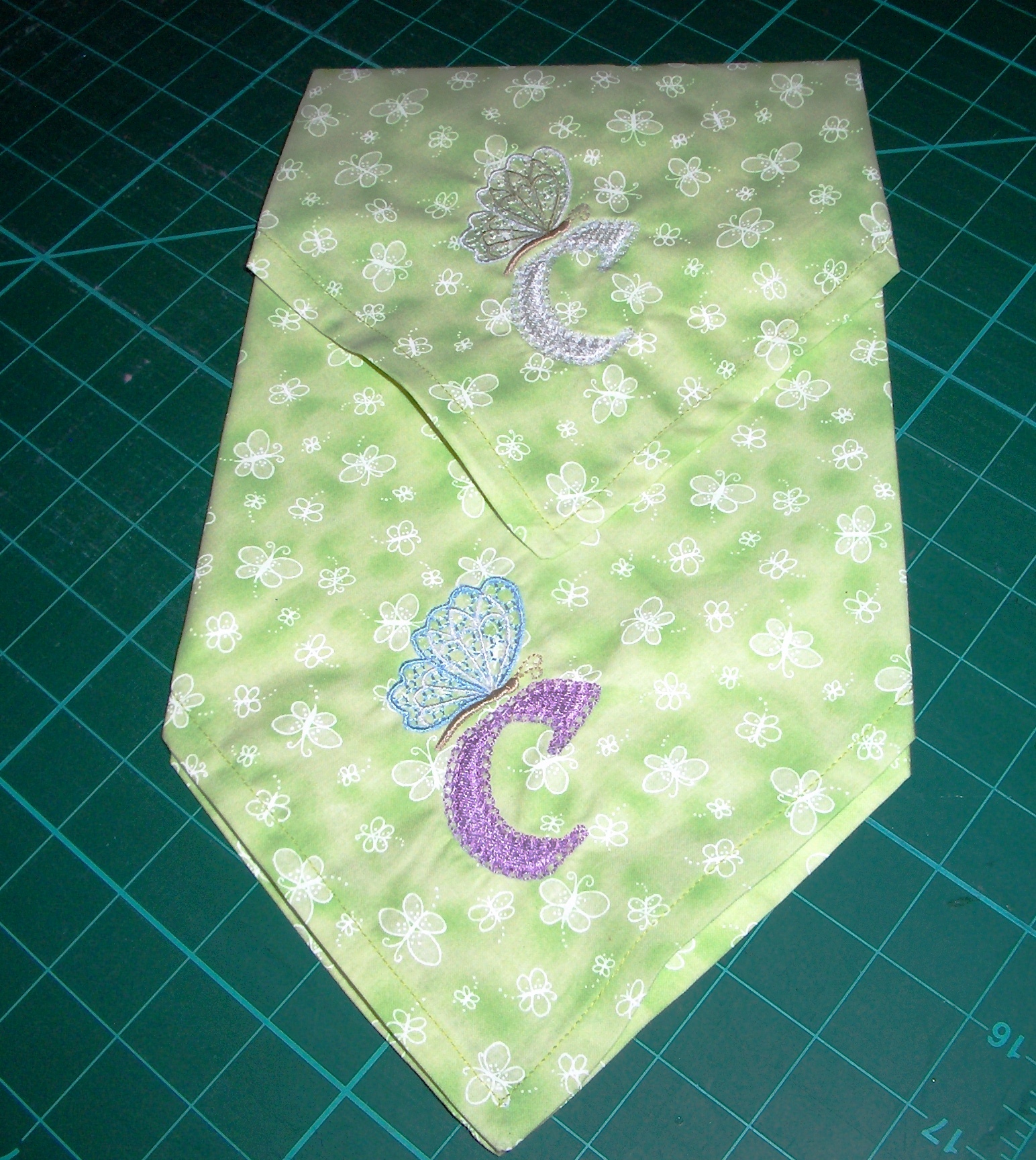
4770The second colour stands out better, maybe the white on a solid or less busy fabric.. thanks for sharing
 119790
Both look very nice as you noted one more for delicate other more stand out of design. Make up 2 sets bold and more quiet. This fabric is nice for spring setting.
 86901
86901both are pretty but I think the dark one shows up better
 by pldc
06 Apr 2013
by pldc
06 Apr 2013
it does but I think the one may be more suited for special dinners? I think that my next set will be a bit of both like Mary suggested thanks Buffy, hugs Loralye
 18031
18031They both work for me and the different colors makes it easier for one to spot their favorite napkin.
 89895
89895the darker one looks great ..
by pldc
06 Apr 2013
thanks it does show up better but the white one looks sew pretty too? I will make more of both I think, Hugs Loralye
 70767
70767I love the lighter one as it blends with the fabric. Great job on them both Loralye. Love Chris
 234253
I definately like the colored one more. I did not even notice the white one until I enlarged the picture. The white just blends right in. Very pretty added touch. Hugs, Susan
by pldc
06 Apr 2013
thanks Susan, she is old sew maybe the colored would stand out for her to see better? Now I really am confused. hugs Loralye
 25510
25510I like them both also. the color does pop out a bit. Love the letter, Can I have one? are these for you?
by pldc
06 Apr 2013
yes these are mine, but I am hoping to make more for mil for mothers day thanks Christine
 173580
I like them both. If you are looking for delicate and subtle, go with the first. The second one is bold and beautiful.
by pldc
06 Apr 2013
see thats just what I was thinking too, thanks my friend we have a great eye ;0) husg Loralye
 57608
57608I like them both but the second one stands out more hugs:):)
by pldc
06 Apr 2013
it does too, but the first is more delicate sew I am still not sure which is the way to go, thanks Hugs Loralye
 360368
I thought these might make a nice set for mothers day too. well not this pr but another set
299557