

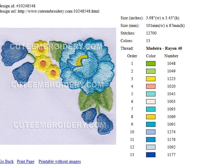
You can download a colour chart for every design - I took a snip, see picture 1
In picture 2 I put the vp3 (left) and the pes (right) in my 6D programme.
As you can see the colours are quite different.
The first (green) colour is 1050 for vp3, 1079 for the pes, while the colour chart gives the lighter 1048 - all Madeira.
As to why that happens - the various software suites use different brands of thread. Brother uses their own range, 6D uses Madeira but my Ruby uses RA or Sulky. Converting from one brand to another gives a best possible match, not an exact one. I think that causes the difference.
If you want to stick as close to the original I'd save the original colour chart.
 [2]
[2]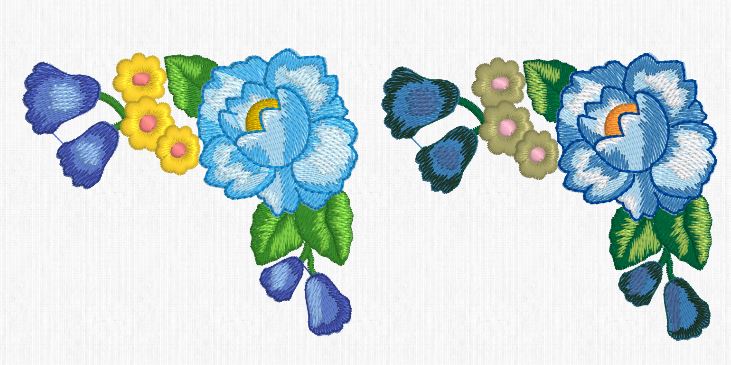
 145191
On Cute designs a JPG is included. If you download that you will be able to use similar colours to the original. A lot of other designers include a graphics file in the zip files as well.
I always do a screen shot of the design and keep it with the embroidery file so that I can see what the original colors were. If I want to duplicate the original colors, I often don't have a thread that matches the original, so I choose from what I have to get the effect I want. I don't have all the different brands of threads either, but that doesn't matter to me. I use rayon and poly in the same design too if I want a specific color. You just have to keep in mind that rayon will fade if bleach is used when washed.
Attached is a link to a very old post here on Cute where mops explains some of the differences. I download vp3 as an alternate format. I know digitizers use software to create the design and that the designs that are translated vs. digitized in another format often lose information/data. Seeing the differences in color as well as stitch count fascinates me.
 57618
57618Well, I for one, never take notice of the colour choices. I choose my own or something that is close to nature’s colours. I’ve got premier plus 2 software too. Still learning! Love Chris
 234253