

 27356
27356
27356
27356Jenne, I answered your PM and its double. Have a look, please.
 145190
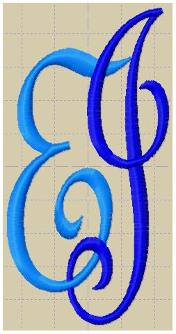
It is difficult to get a good overall shape when you have JE unless the curl of the J is reshaped. EJwould be easier to intertwine, but that's not the order you want.
I think the second one looks more like a nice monogram.
The font is called French Script. In the first I sharpened the points, in the second added some carving in the wider parts.
 [2]
[2]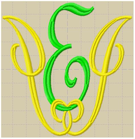 145190
Something like this?
 by jenne
25 Oct 2017
by jenne
25 Oct 2017
https://www.etsy.com/listing/5180...
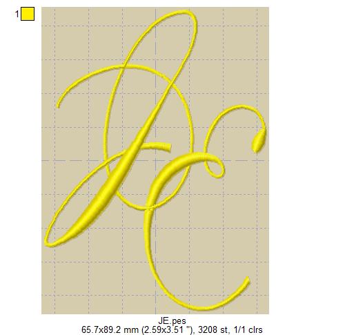
I love the letters you did, But most of the time they look more like this link .
 by mops
26 Oct 2017
by mops
26 Oct 2017
I have seen beautiful ones, like the one you pointed out, using symmetrical letters, A, H, I, M, O, T, U, V, W and X. Our king's initials W A were combined in a classical intertwined monogram. Other letters are sometimes mirrored to give some symmetry, as the R in ER (Elisabeth Regina). That would work for a J as well.
145190