

 [2]
[2]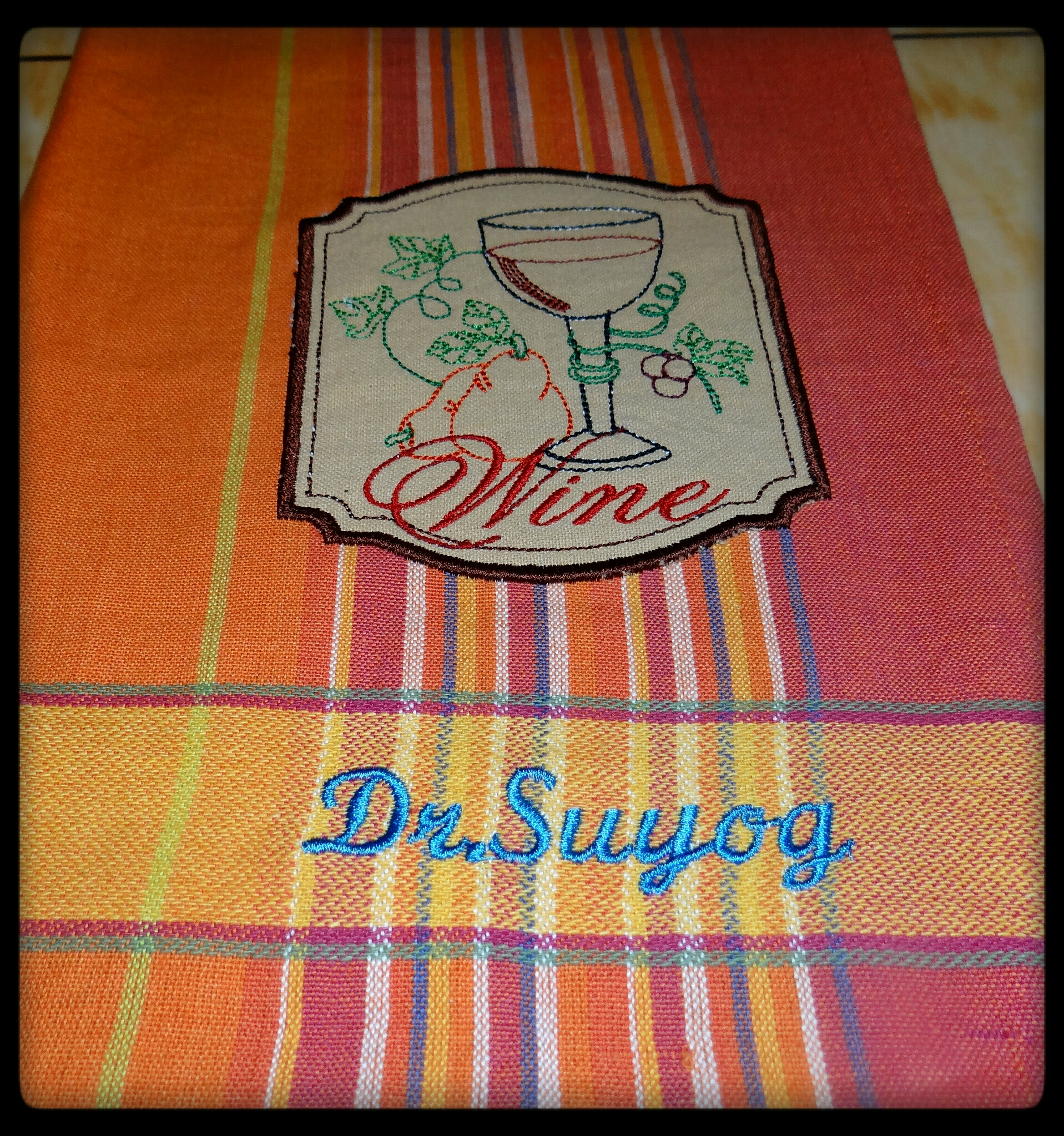
Thanks a lot to everyone for helping me out...I appreciate your valuable suggestion.
Flowers for all..***
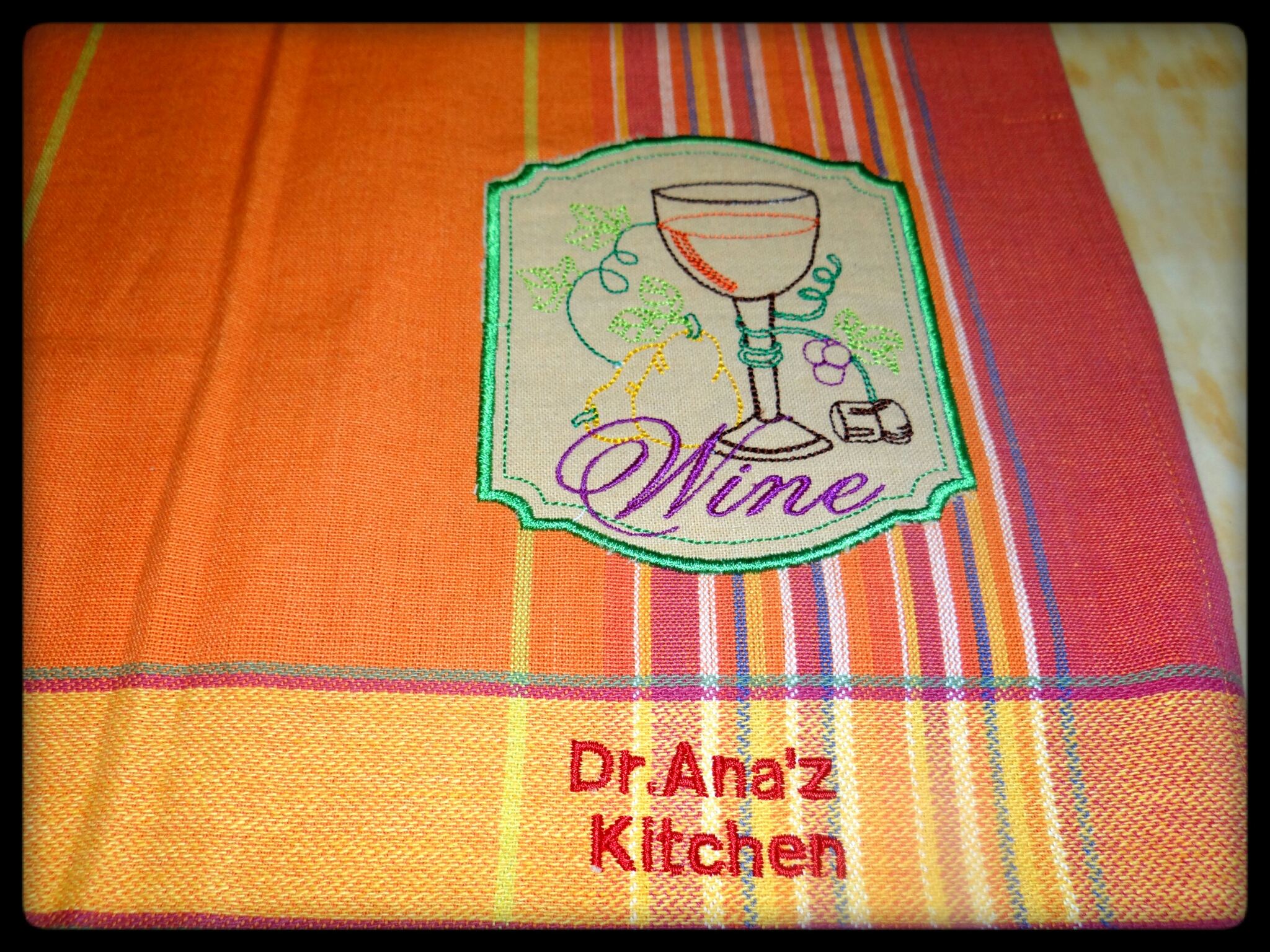
I like both colorations, but like the way the applique stands out with the black or dark brown edge.
For me I love the first one best - but the second is also good. Hard decisions to make for you! But I really love your idea of doing an applique. It makes it easy to use kitchen towels with colorful patterns and the embroidery shows good on a unicoloured applique - and it's also a great idea to write the names there where you have done. Thanks for sharing your superb work - Maria
It was my observation that..it's easy to clean n to maintain kitchen linens with Applique than embroidery...
It was idea of my husband to write name on embroidery or applique ...so that who so ever came across my projects..will knw that they r homemade...n not purchased... very few people have machine with them for embroidery...ie for personal use...
Thanks a lot for your valuable suggestion.
2nd one Just comes to life!!!!Well done..Gorgeous
My vote is the 2nd one and think the writing should be the same color of embroidery patch/Lillian
will follow this suggestion for sure in next napkins I do.
Thanks a lot for your valuable suggestion
 145789
I like the second one best but agree with the others to make the text the same color as design border. Good Job. Hugs
Yes..even I will follow this suggestion for next napkins...
Thanks a lot for your valuable suggestion
I agree with queenofhearts - I'd match your text with the border of the design. If it was me, I'd choose the darker blue (the predominant colour stripe) for the border instead of the lighter green as in the first one. Love Chris
I agree with you ... it's really good idea to use dark blue...
Thanks a lot for your valuable suggestion...
 234253
I like the second one but would make the color of the text match the border.
I would like the first one too if you changed the color of the border. But it is very hard to know for sure because the camera plays tricks with colors.
Very true .. camera plays tricks..
I took vibrant colours for font..so that they should stand out...
Thank-you so much for your valuable suggestion
 22590
22590 360368
Very nice stitching. I agree, choosing colors can be tricky, they really change the look of the design. I'm kind of leaning towards the darker outline, though I think what I would like best would be to pick a color that matches one of the stripes in the napkin for the outline. For the design, I think I like the colors in the first picture best. Hopefully some other cuties will have some more helpful comments. I personally am not very good at making decisions.
Same here ..even I'm not good at decision making...
Ur idea is good to choose one of the colour that matches stripes ..
Thanks for your valuable suggestion.
 11468
11468Both are lovely, but I do believe I prefer the colors in the second one...looks like the cork is in the first one but not in the second one, too....
Ohh really ..Cork is missing in 2nd... that part of design is missed by me somehow.. button might have pressed those so that thread colour is missed..
Thanks a lot for your valuable opinion.